My campaign is about 'Scallys. The picture i chose was a image from google. I didn't want to do a serious campaign so i thought by doing scallys would come across as humorous.
  This is my final design for my campaign.
  I have also designed a hat for the campaign. The programme i used was Photoshop. The icon of the man that is on the hat was from a sign that is in general used for buildings site ‘no unauthorized person allowed beyond this point’. I thought that would be a good image to use for my idea as the man has an angry look on his face and for the hand, I positioned the Fosters logo on his hand to say ‘don’t drink fosters’.
Other poster ideas for my campaign.
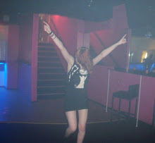
 For this poster, I decided to make something simple and effective so I used the ‘CHAV’ text and placed it onto a picture of ‘chavs\scally’, that was edited on Photoshop. I don’t really like the background of the poster would I don’t think that the text contrast well.
  For this poster, I decided to make something simple and effective so I used the ‘CHAV’ text and placed it onto a picture of ‘chavs\scally’, that was edited on Photoshop. I don’t really like the background of the poster would I don’t think that the text contrast well.
  This is another idea I recently came up with for my campaign. The idea for this concept was to make the ‘chav/scally’ sound like that they are some kind of human species that can be found in numerous places. I made the layout of the postcard as if it was a scientific diagram. I truly like this postcard as it highlights the key points and I find it quite funny, which I wasn’t the postcard to be looked at in that view.
Evaluation
Overall, i enjoyed this unit on making the poster. Even though, i struggled on some ideas, i believe i have produce some good icons for my campaign. I like the idea that i chose, which was about ‘Chavs/Scallys’ as i wanted to make the campaign funny and amusing for other people to have the same views as me. If i had to change anything on the campaign, i would of not took as much time on making the poster and would of gone for something more simple and effective to create. But i do like the outcome of the poster and i am pleased with what i have produced.